




- Category:
Branding, Design, Development
- Design:
Figma, Adobe
- Technologies:
HTML, CSS, JavaScript
- Client:
Stepping Stones
- Date:
7/17/26
Stepping Stones
Stepping Stones is a Bay Ridge, Brooklyn early childhood center offering play-based, research-backed programs for toddlers through Pre-K, along with extended day, after-school, and summer camp options across two neighborhood locations.
Challenge
Stepping Stones had run on the same WordPress site for 25 years. Parents needed basic things: program details, enrollment steps, a way to get in touch. All of it was buried in a navigation structure nobody had touched since the site was first built. Every update turned into its own mini-project. The team couldn’t make small changes without breaking something else, so edits that should have taken minutes took hours, or just didn’t happen. The site was also slow, which matters more than it sounds for a local business: a parent comparing childcare options is deciding in seconds whether to keep browsing or pick up the phone. There was no contact form anywhere on the site, so a parent wanting to book a tour had to track down a phone number or an email address on their own, and while an employment page existed, it listed a phone number and email instead of a way to apply or submit a resume online. There was no photo gallery for parents to see the classrooms and activities, no social media feed pulling in what the center was already posting, and no testimonial page for prospective families to read about other parents’ experiences.
The gap between the site and the actual business was hard to miss. Stepping Stones had built a real reputation over two-plus decades in Bay Ridge, and the site didn’t show it. The center’s 25th anniversary gave us a deadline, and a reason to rebuild the brand rather than keep patching the old one.
Solution
We rebuilt Stepping Stones’ identity from the ground up, timed to the 25th anniversary. The client wanted something upscale and grounded: no primary colors, no cartoon mascots, none of the visual shorthand most childcare brands reach for by default. We built the brand guide around a muted, quiet color palette and set the logo and headlines in serif type, which gives the mark a sophisticated, high-end feel and reads more established than the rounded, playful fonts common in the space. Body copy switched to a cleaner sans-serif, so everyday text stays legible and the brand still feels warm to the families reading it. That look now runs through the website, business cards, and other printed materials, replacing what had been a patchwork built up over 25 years with one coherent identity. In a neighborhood where most competing centers lean on the same clip-art shorthand, or don’t have a considered visual identity at all, that polish is what makes Stepping Stones read as the established, professional option the moment a parent lands on the site.
The website started from a blank page, organized around what a parent actually needs: programs by age group, both Bay Ridge locations, and a straight path to booking a tour. The two locations run different hours and have separate phone numbers, and the client wanted that spelled out for every program rather than folded into a single generic contact block, so each program page lists the hours and phone number for its specific location alongside its daily schedule. That way parents can see what a real day looks like, and know exactly who to call, before they ever pick up the phone. There’s also a dedicated events page with a monthly calendar, built so staff can update it themselves and share it directly with parents instead of sending out a flyer or a separate email. A “Book a Tour” CTA runs throughout the site, guiding parents straight to a tour request form instead of leaving them to find a phone number on their own, and a careers page gives teachers an actual way to apply and submit a resume online instead of just a number to call. A new photo gallery shows parents what a real day at the center looks like, a live social media feed keeps the site current without extra work from staff, and a dedicated testimonial page lets prospective families read what other parents have to say before ever booking a tour. Together, those three additions give parents a stronger sense of trust and a real feel for the day-to-day experience before they ever set foot inside. It runs on modern infrastructure rather than legacy WordPress, which means faster load times and none of the bugs that used to come with every edit.
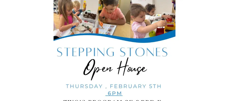
Before
Click the image to view it uncropped at full size.
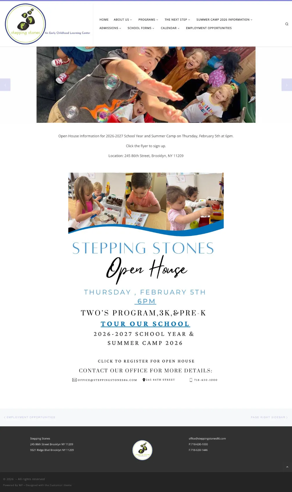
After

Final Result
The site runs faster, parents can find what they need, and staff can keep the calendar current on their own. Launching alongside the 25th anniversary gave the rebrand a clear moment to reach both the families who already know the center and the ones just finding it in Bay Ridge for the first time. Since launch, Stepping Stones has seen more parents visiting the site, along with a steady stream of tour inquiries and employment submissions coming in through the new forms.
Visit Site
Work With Us

Let’s Work Together
Your digital partner in helping you bridge the gap between your business brand and customers