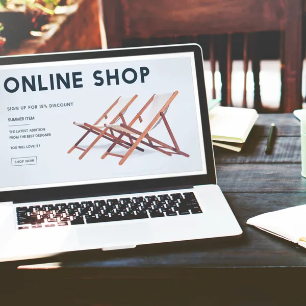
Bold Designs.Fast Websites.

We specialize in digital web solutions that
help elevate your business to the next level

SEE OUR WORK
BASED IN NEW YORK CITY, NY BASED IN NEW YORK CITY, NY
Highlighted Info Block

Unlock Revenue Growth for Your Business

In today's market, having a great product or service isn't enough—people need to find you, trust you, and engage with your business online.

We enable small business owners to succeed with their brand online by helping them define, design, solve, and implement web solutions through identity branding, web design, web development, e-commerce, SEO and PPC Ads.

About us

What We Can Do for Our Clients

01

Your brand is more than just a logo—it's the face of your business, the first impression you make, and the story you tell.

02
03
04
05

Our Work

Probizz
  • Branding
  • /
  • Design
  • /
  • Development

Probizz

Probizz offers consulting and advisory services in leadership development, organizational management, change implementation, and logistics support, enabling institutions to navigate complexity, enhance coordination, and deliver sustainable impact.

View Project
Pinnacle Coaching & Consulting
  • Branding
  • /
  • Design
  • /
  • Development

Pinnacle Coaching & Consulting

Pinnacle Coaching & Consulting is premier advisory firm operated by certified coach Steven Toss focusing on transformative business and career coaching for entrepreneurs, business owners, and career-minded professionals.

View Project
Wear LIC
  • Design
  • /
  • Development

Wear LIC

Straight out of Long Island City comes amazing collections of vibrant, bold, hip, edgy, and modern designed graphic tees made for comfort from 100% cotton for everyday wear.

View Project
Canopy Collective
  • Design
  • /
  • Development

Canopy Collective

Canopy Collective is a premier short-term rental co-hosting company dedicated to maximizing your property’s potential while delivering exceptional guest experiences and services.

View Project
Highlighted Info Block

Client Stories

icon

Surge River is a fantastic firm. With decades of experience working with web design companies of all sizes, I can confidently say that Mike brought professionalism, expertise, and real peace of mind to the entire process. I tasked him with several UX challenges, and he delivered thoughtful solutions that only elevated our site. The finished website for our short-term rental business exceeded anything I had imagined and clearly differentiates us in the market. I highly recommend!

Mary B.

President + CEO

We were looking for help updating our website. Surge River supplied us with a transparent proposal with clear pricing and timeframe. Throughout the process, Mike provided helpful tutorials over the changes in order to have a smooth transition afterwards. We are extremely happy with the results and would recommend Surge River to anyone needing website development.

Edward C.

Director of Business Development

I recently had Mike redesign my business website and rebrand my entire business identity, and I am blown away by the results. From the new logo to the overall look and feel of the site, he absolutely nailed what I was going for. The new branding feels cohesive, modern, and really captures the essence of my business in a way I never could have pulled off on my own. The website is clean, easy to navigate, and looks incredibly professional. It's one of those transformations where you almost can't believe it's the same business. Mike took the time to actually understand my vision and ran with it. The whole process felt collaborative and stress-free, which made a huge difference. If you're thinking about refreshing your brand or rebuilding your site, I can't recommend Mike enough. The results speak for themselves!

Sahil P.

Founder & Owner

Surge River and Mike did a great job crafting a site that perfectly fits our brand, and because of that I've received countless compliments from clients and peers. I highly recommend him for his expansive web services, and look forward to referring him when the opportunity arises.

Jason N.

Business Owner

Our site finally feels intentional and performs the way it should. Everything was built with purpose, from design to functionality. We’ve seen better engagement and clearer messaging since launch, and we have Mike to thank for that. His expertise and way he handled our work from start to finish was very professional, we would love to work with him again in the future.

Lisa M.

Business Owner

Insights

Image related to what a website for electricians, plumbers, and landscapers actually needs
Jun 21, 2026InsightsTipsBy Mike Wong

What a Website for Electricians, Plumbers, and Landscapers Actually Needs

I’ve built websites for a handful of trade contractors over the years: electricians, plumbers, landscapers, HVAC companies. Almost every single one came to me with the same complaint: their current site looked fine, but the phone wasn’t ringing from it.

When I dig into why, the answer is almost always the same. The site was built by someone who thought “professional website” meant clean design and a contact form. Those things matter, but they’re not what makes a trade business website actually generate leads.

A homeowner searching “electrician near me” at 9pm after a circuit breaker trips isn’t browsing. They’re deciding, fast, whether to call you or the next result. Your site has about ten seconds to give them a reason to choose you. Most trade contractor sites don’t do that.

Here’s what actually works.

The First Problem: Generic Sites Built for Nobody in Particular

Page builder templates are designed to look professional for any type of business. That’s their selling point and their weakness. A landscaper and a life coach can use the same Squarespace template, change a few photos, and have an equally bland result.

Trade businesses have specific buyers with specific urgencies. A homeowner needs an emergency electrician. A property manager needs a reliable plumber for ongoing work. A new homeowner wants a landscaping company they can trust long-term. Each of those people is looking for different signals when they land on a site.

A generic “Welcome to our business” homepage with a stock photo of someone in a hard hat doesn’t give any of those signals. It just confirms you exist.

What the Homepage Actually Needs

The homepage for a trade business needs to answer four questions within the first two screens, without the visitor having to scroll or search.

What do you do? Sounds obvious, but a lot of trade sites bury this. “Expert Solutions for Every Home” means nothing. “Licensed Electrician Serving Bergen County, NJ” means everything. Be specific about the trade and the service area from the headline.

Do you serve my area? Local service area is the first qualifying question every trade business visitor asks. Put it in the headline or directly below it. Not on the “Contact” page. Not in the footer. On the first screen.

Can I trust you? This is where most sites fail. Trust for a trade business comes from specific signals: how many years in business, whether you’re licensed and insured, what past customers say. A five-star average with 80 reviews beats a polished logo every time. Show real reviews, not just a generic testimonials section.

How do I contact you? The phone number should be large, visible, and tappable on mobile. Put it in the header, not just the contact page. Most people searching for a plumber or electrician want to call, not fill out a form. Make calling the easiest possible action.

Fact: 88% of consumers who search for a local business on a mobile device call or visit within 24 hours. If your phone number isn’t prominent on mobile, you’re losing those leads.

Why Mobile Matters More for Trades Than Almost Any Other Industry

When someone has a leak, a dead outlet, or overgrown hedges before a party this weekend, they’re searching on their phone. Not a desktop. Not even a tablet.

A website for plumbers or electricians that isn’t fully optimized for mobile isn’t just inconvenient. It’s invisible. Google ranks the mobile version of your site first. A slow, hard-to-navigate mobile experience means lower rankings and higher bounce rates before a single person even reads your services page.

The standard here isn’t “it loads on a phone.” It’s tap-to-call in the header, readable text without zooming, fast load time on cellular, and a contact form that takes less than 30 seconds to fill out. We cover what mobile-friendly actually means in detail in our post on mobile-friendly website design.

The Pages That Most Trade Websites Are Missing

Most trade websites have: Home, About, Services, Contact. That structure misses several pages that actually drive leads.

A service area page (or pages). If you serve ten towns, Google needs to know that. A dedicated page for each major service area (like “Electrician in Hoboken NJ” or “Electrician in Jersey City NJ”) is how local service businesses rank for location-specific searches. Generic “we serve the tri-state area” text on a contact page doesn’t rank for anything.

Individual service pages. One “Services” page listing everything you offer doesn’t rank for specific searches. “Emergency electrical repair,” “panel upgrades,” “outdoor lighting installation”: each of these is a separate search with separate intent. A page for each service targets those searches specifically.

A reviews or social proof page. Collecting reviews on Google is important. Displaying them on your site is also important. A dedicated page that pulls in or showcases your best reviews gives visitors a reason to trust you before they even check Google. Photos of completed jobs on this page make it even stronger.

A FAQ page. Electricians, plumbers, and landscapers answer the same questions over and over. “Do you offer free estimates?” “Are you licensed and insured?” “How quickly can you respond?” Putting those answers on the site removes objections before the phone call. It also captures long-tail search traffic from people who type those exact questions into Google.

The Trust Signals That Actually Convert

For trade contractors, trust isn’t built with a nice logo and a clean layout. It’s built with specific, verifiable proof.

License and insurance information displayed visibly on the site. Not buried in a PDF or mentioned only in a footer line. Prominent, with the actual license number if applicable.

Real photos of real work. Stock photos of generic job sites don’t build trust. Before-and-after photos of your actual projects, even taken with a phone, convert better than professional photos of someone else’s work.

Named reviews with job details. “John did a great job, highly recommend” is weak. “John replaced our main electrical panel in a day, on time and under budget. Best contractor we’ve hired in 15 years” is specific enough to be believable.

Response time commitment. “We respond within 2 hours” or “Same-day estimates available” removes one of the biggest friction points in hiring a contractor. People don’t call if they don’t know when they’ll hear back.

What to Look for When Hiring Someone to Build It

A website for electricians or plumbers isn’t the same project as a website for a restaurant or a consulting firm. The person building it needs to understand local SEO, service area targeting, mobile-first design, and lead capture. Not just visual design.

Ask specifically about local SEO setup: schema markup for local businesses, Google Business Profile integration, service area pages. Ask how they handle mobile load speed. Ask whether the site will be easy for you to update without a developer, or whether every small change requires a call and an invoice.

The lowest-cost option is almost never the right one for a trade business that depends on the phone ringing. We cover what cheap websites actually cost in the hidden costs of a cheap website.

A Quick Checklist Before You Launch

Run through this before any trade business website goes live.

  • Phone number visible and tappable in the header on mobile
  • Service area named in the homepage headline or directly below it
  • License and insurance status displayed prominently
  • Real photos of your actual work, not stock images
  • At least five genuine reviews shown on the site
  • Individual pages for your main services
  • Site loads in under 3 seconds on a mobile connection
  • Contact form is five fields or fewer
  • Google Business Profile linked and consistent with the site

If a site passes all of these, it’s built to generate leads. If it fails three or more, it’s a site that exists but doesn’t work.

If you’re a trade contractor looking to build a site that actually brings in customers, let’s talk about what your business specifically needs.

Read MoreWhat a Website for Electricians, Plumbers, and Landscapers Actually Needs
Image related to why your website copy is losing you customers
Jun 20, 2026InsightsTipsBy Mike Wong

Why Your Website Copy Is Losing You Customers

A few years back I redesigned a site for a financial advisor. His old site had a clean layout, professional photos, and a clear menu. I asked him what his conversion rate was. He said he wasn’t sure, but leads from the site had always been slow. Then I actually read his homepage copy.

The headline said: “Comprehensive Financial Planning Services for Individuals and Families.”

Every word of that is accurate. None of it makes anyone want to call him.

We rewrote it to: “You’ve worked hard to build what you have. Let’s make sure it’s protected.” Leads from the site doubled within two months. Same design, same traffic. Different words.

That’s what website copywriting does. And most business websites don’t have it.

What Website Copywriting Actually Is

Website copywriting is the writing on your site that gets people to take action. Not just describing what you do, but giving visitors a reason to care, a reason to trust you, and a clear next step.

It’s different from content writing. Content writing is articles, blog posts, educational material. Copywriting is the words on your homepage, your services page, your about page, your contact page. The words people read when they’re deciding whether to hire you.

Most business owners write their own website copy, and most of them write it the same way: they describe their services, list their credentials, and add a “contact us” button at the bottom. That’s not copywriting. That’s a resume. And a resume doesn’t sell.

The Mistake Almost Every Business Website Makes

The most common copy mistake is writing about yourself instead of your customer.

“We are a family-owned plumbing company with 20 years of experience serving the greater metro area.” That sentence is about you. Your customer’s actual question when they land on your site is: can you fix my problem, fast, without overcharging me, and will you make my life easier? Answer that question directly and you have copy that converts.

Good copywriting for websites flips the focus. Instead of “We offer professional landscaping services,” it becomes “Get a yard you’re proud of without spending your weekends on it.” One describes a service. The other describes a result the customer actually wants.

The second version wins, every time.

The Pages Where Copy Makes the Biggest Difference

Not all pages carry equal weight. These three matter most.

Your homepage. This is where most visitors decide whether to stay or leave, usually within five seconds. The headline needs to answer one question: what do you do and who is it for? Sub-headlines and supporting copy need to immediately address the customer’s main concern or pain point. If your homepage opens with your company name and founding year, it’s not doing its job.

Your services page. Most services pages list features. A strong services page describes outcomes. Instead of “Social Media Management: We post to your channels three times per week,” write “Your social media handled, consistently, so you can focus on running the business.” Feature versus outcome. The outcome wins.

Your about page. Counterintuitively, the about page isn’t really about you. It’s about why a customer should trust you with their problem. The best about pages connect your background to the customer’s benefit. Your 15 years of experience matters to them because it means fewer mistakes, faster results, and someone who’s seen their situation before.

If these three pages are written in “we” language and describe services without mentioning what customers actually gain, that’s where to start.

What Good Website Copy Looks Like

Good copy is specific. “We help small businesses grow” means nothing. “We’ve helped 40+ contractors in the New York metro area get more leads from their websites” is specific and credible.

Good copy is direct. It doesn’t circle around the point. The headline says the thing. The first sentence supports the headline. No throat-clearing, no preamble.

Good copy speaks to one person. Not “customers” or “clients” or “individuals and families.” One specific person: a restaurant owner who can’t get enough foot traffic, a contractor who gets leads but can’t convert them, a service business owner whose website looks nothing like the quality of work they actually do.

Fact: According to Nielsen Norman Group, users read about 20% of the text on a web page. The copy that lands is the copy that gets straight to the point.

Good copy has a clear call to action on every page. Not just at the bottom. Not just “contact us.” Something specific: “Book a free 20-minute website review” or “Get a quote today, response within 24 hours.” The more specific the ask, the more likely someone is to take it.

Why Most Business Owners Shouldn’t Write Their Own Copy

It’s not about writing ability. Most business owners are perfectly capable writers. The problem is proximity.

When you’re inside your own business, you know too much. You default to industry language because that’s how you think about your work. You focus on features because those are the things you built. You describe your process because you’re proud of how it works. None of that is what your customer needs to read.

A good copywriter, or a web designer who thinks about copy as part of the process, brings the outside perspective. They ask: what does your customer actually want? What are they afraid of? What objections do they have before they even contact you? And then they write to those things directly.

This is also why copy and design can’t be treated as separate problems. A well-designed page with weak copy doesn’t convert. Strong copy on a poorly designed page doesn’t convert either. They work together to guide someone from “I landed here” to “I’m contacting them.” We cover how design and development fit into that same process in our post on web design vs web development.

A Simple Framework for Fixing Your Own Copy

If you want to improve your site copy before a full redesign, start with this for each page:

  • What does this visitor want? Not what you offer. What they came to find.
  • What are they afraid of? Cost, wasted time, hiring the wrong person. Address it directly.
  • What’s the one thing you want them to do? Make that the clearest element on the page.

Run your homepage through those three questions. If your current copy doesn’t answer all of them within the first two screens, rewrite what’s above the fold before anything else.

Good copy doesn’t need to be long. It needs to be relevant, specific, and honest. If you can say the same thing in eight words instead of thirty, say it in eight.

When It’s Time to Bring In Help

If your site has been live for more than six months, you’re getting reasonable traffic, but your contact form is quiet: copy is usually part of the problem. The other part is often design, layout, or mobile performance. The two are almost always connected.

A website that looks credible, loads fast, and says the right things to the right person is what actually generates leads. If you’re missing any one of those, the others can’t compensate. Our post on how a well-designed website can boost business covers how design and copy work together to drive real results.

If you want a second set of eyes on what your site is actually saying, and whether it’s saying the right things, that’s something we can look at together.

Read MoreWhy Your Website Copy Is Losing You Customers
Image related to is your business website mobile-friendly?
Jun 19, 2026InsightsTipsBy Mike Wong

Is Your Business Website Mobile-Friendly?

A client came to me last year with a service business doing solid work in their area. Steady referrals. Decent reviews. But their website leads had dried up. They assumed it was a slow season. I pulled up their site on my phone while we were talking and we both watched it load for six seconds, render a desktop layout crammed into a four-inch screen, and show a phone number in text too small to tap. Their call to action on the website? Buried below a wall of copy you’d have to pinch-zoom to read.

That was the problem. Not slow season. A site actively pushing people away.

More than 63% of all Google searches in the US now happen on mobile. If your site doesn’t work well on a phone, you’re losing more than half your potential traffic before they’ve read a single word about what you do.

Here’s what mobile-friendly website design actually means, why Google penalizes you if you get it wrong, and how to check where you stand today.

What “Mobile-Friendly” Actually Means

It doesn’t mean your site can be opened on a phone. It means your site was built to be used on one.

A site that “works” on mobile might technically load but still require visitors to pinch and zoom to read text, tap tiny links clustered together, scroll sideways, or wait ten seconds for images on a cellular connection. That’s not a mobile friendly webpage. That’s a desktop site shrunk down and called good enough.

A genuinely mobile-friendly site does four things. Text is readable without zooming. Buttons and links are large enough to tap with a thumb, not a cursor. Content fits the screen width without horizontal scrolling. And the page loads fast on a real mobile connection, not just office Wi-Fi.

Responsive design is the technical approach that makes this happen. Instead of building a separate mobile version or squishing a desktop layout, a responsive site uses flexible layouts that adapt to whatever screen the visitor is on. Phone, tablet, wide desktop monitor: the site reorganizes itself to fit. This is the standard now, and it’s what separates a properly built mobile website design from a site that just happens to not be completely broken on a phone. If you want to understand how this fits into the broader picture of how a site gets built, our breakdown of web design vs web development covers exactly that.

Why Google Cares About This More Than Almost Anything Else

In 2019, Google switched to mobile-first indexing. That means Google now crawls and ranks the mobile version of your site first. Not the desktop version. Not the one you probably tested before launch.

What this means in practice: if your mobile site is missing content, loads slowly, or isn’t configured correctly, Google will rank it lower regardless of how clean your desktop site looks.

You click a search result. Three seconds pass. Four. Still loading. You hit back. Google tracked that. A user abandoning your page within seconds tells Google the result wasn’t satisfying, and your ranking slides accordingly. This connection between mobile performance and search visibility is direct, not theoretical. We cover how UX decisions affect rankings in more depth in our guide on how to improve SEO with UX.

Fact: According to Google, 53% of mobile users will leave a page that takes longer than 3 seconds to load.

The penalty isn’t a warning or an account flag. It’s gradual and quiet. Rankings drop, traffic drops, and you assume it’s just a competitive market. In most cases I’ve worked on, mobile performance was at least part of the story.

How to Check If Your Site Is Actually Mobile-Friendly

Three ways to find out, starting with the fastest.

Use your own phone right now. Pull up your site on your actual phone, on cellular data, not Wi-Fi. Navigate to your contact page. Try to tap your phone number, your email, or your contact form button. If anything is hard to find, small to tap, or takes more than three seconds to load, you already have your answer.

Google’s PageSpeed Insights. Go to pagespeed.web.dev and enter your URL. Run the mobile report specifically, not desktop. It gives you a score from 0 to 100 and identifies specific issues: images that aren’t compressed, content that shifts while loading, elements too close together for a finger to tap accurately. A score below 50 on mobile is a real problem. Below 70 is worth addressing seriously.

Google Search Console. If your site is connected to Search Console, look under Experience, then Mobile Usability. It shows which pages have errors and exactly what those errors are. The most common ones I see are text too small to read, clickable elements too close together, and content wider than the screen. These are fixable, but they typically point to a site that wasn’t built with mobile in mind from the start.

What a Non-Mobile Site Is Costing You Right Now

The cost isn’t abstract. It shows up directly in your numbers.

If 60% of your traffic is on mobile (close to the current average) and your mobile experience causes even half of those visitors to leave without acting, you’ve cut your effective reach by 30% before doing anything else wrong. For a local service business getting 500 visitors a month, that’s 150 people walking out the door.

Fact: 57% of users say they won’t recommend a business with a poorly designed mobile site.

Then there’s the conversion gap. A site with a clear, visible call to action on a website (a prominent phone number, a tap-to-call button, a short contact form above the fold) converts mobile visitors at 3 to 4%. A site where the contact form is buried or the number is too small to tap converts at under 1%. On those same 500 monthly visitors, the difference is 5 leads versus 15 to 20.

That’s website conversion rate optimization without changing a word of your copy or spending anything on ads. Just making the site work correctly on the device most of your visitors are using.

Signs Your Site Is Not Mobile-Friendly

Check these on your phone before doing anything else.

  • Text is small. You need to zoom to read a paragraph comfortably. Body text on mobile should be at minimum 16px. If yours is smaller, that’s a problem worth fixing.
  • Buttons are hard to tap. The “Book Now” or “Call Us” button requires precise aiming. Tap targets should be at least 44 by 44 pixels. Small buttons kill conversions on mobile.
  • The layout scrolls sideways. Any horizontal scrolling on mobile is a layout failure. Content should fit the screen width without the user needing to scroll left or right.
  • Images load slowly. Large uncompressed images are one of the main culprits for slow mobile load times. If your hero image takes 4 or more seconds, it’s hurting both user experience and rankings.
  • The contact form has too many fields. On desktop, a six-field form is manageable. On mobile, it kills the conversion. Three fields is the ceiling for most service businesses.
  • Your phone number isn’t tappable. If a user has to copy and paste your number to call you, most won’t. They’ll find someone else.

If three or more of these apply, the site needs real work. If all of them apply, it’s actively costing you business every day.

What Actually Makes a Site Truly Mobile-Friendly

There’s a spectrum here, and “not broken on mobile” is the floor.

At the bottom are sites where you can technically read the content if you zoom in and scroll sideways. These fail Google’s usability tests and send visitors away in seconds.

In the middle are sites built with a page builder like Wix or Squarespace. The layout adjusts for mobile, which is better than nothing. But these platforms often produce slow pages with heavy code underneath, and their mobile layouts frequently stack content in an order that doesn’t match how mobile users actually make decisions. The contact button ends up at the bottom. The trust signals disappear. The form has eight fields.

At the top are sites built with mobile as the starting point. Mobile-first design means every layout decision, font size, button placement, image weight, and content order was made for a small screen first and then expanded for desktop. Sites built this way with proper sites responsive design load faster, convert better, and hold rankings more consistently through Google’s algorithm updates.

The practical difference between the middle and the top is usually the difference between a site someone launched themselves and a site a responsive website company built with a real understanding of how mobile users actually behave.

What to Do If Your Site Isn’t Mobile-Friendly

The answer depends on what you’re starting with.

If you’re on Wix or Squarespace, go into your editor and switch to the mobile view. Most of these platforms let you adjust the mobile layout independently of the desktop. Move your contact button higher. Increase font sizes. Remove sections that crowd the screen on small devices. This won’t fix underlying performance issues, but it can meaningfully improve usability.

If your site is on WordPress, the fix depends heavily on your theme. A theme built with responsive design handles most of this automatically. An older theme from 2015 or earlier will fight you on every adjustment. In that case, switching to a modern theme or doing a professional rebuild is usually faster and more reliable than patching.

If your site is fully custom-built and several years old, there’s a real chance it was designed when desktop traffic still dominated. A site designed and developed for mobile today performs differently than one retrofitted to handle it. The load time gap alone is often dramatic.

For a site with multiple mobile issues, fixing them one at a time costs time and usually doesn’t reach the root cause. The structural problems stay. A designer or developer can audit what you have, tell you what’s fixable versus what’s fundamental, and give you a realistic picture of what it would take to close the gap.

Sometimes that’s a few targeted fixes. Sometimes it’s a rebuild that recovers enough leads in the first few months to pay for itself. Either way, knowing where you actually stand is the first step. Run the PageSpeed test. Check Search Console. Look at your own site on your phone with fresh eyes.

If what you find points to something bigger than minor adjustments, that’s a conversation worth having with someone who can look at the specifics and tell you exactly what’s going on. Get in touch and we’ll take a look at your site together.

Read MoreIs Your Business Website Mobile-Friendly?
icon
100% Satisfaction Guarantee
icon
Free Branding / Website / SEO Audit
icon
Personalized Support
icon
100% Satisfaction Guarantee
icon
Free Branding / Website / SEO Audit
icon
Personalized Support

Let’s Work Together

Your digital partner in helping you bridge the gap between your business brand and customers

Let's Talk